Features - Section Designer
Templates Slider
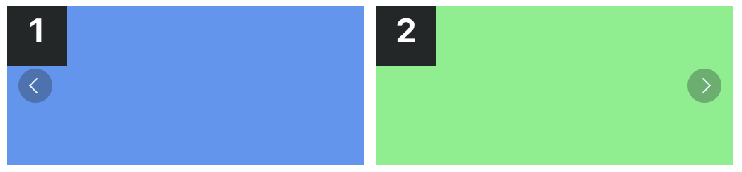
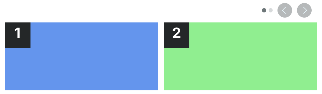
Basic Slider
This is a slideshow where content is displayed one at a time and can be navigated using touch gestures, keyboard arrows or scrollbar.
Classes:
sc-lt-slider sc-tp-100
Custom tag:
<inner-section
  type="slider"
  template="100"
></inner-section>
Key for theme.json:
"slider";

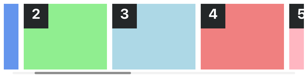
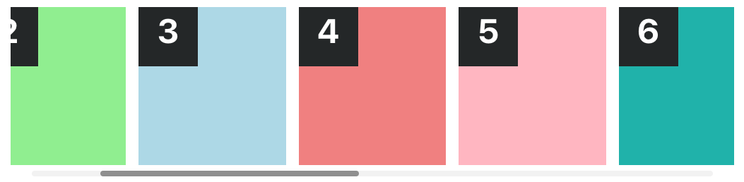
Basic Slider with no-scrollbar
This is a slideshow with no visible scrollbar.
Classes:
sc-lt-slider sc-tp-100 sc-op-nosb
Custom tag:
<inner-section
  type="slider"
  template="100"
  options="no-scrollbar"
></inner-section>
Key for theme.json:
"slider-nosb";

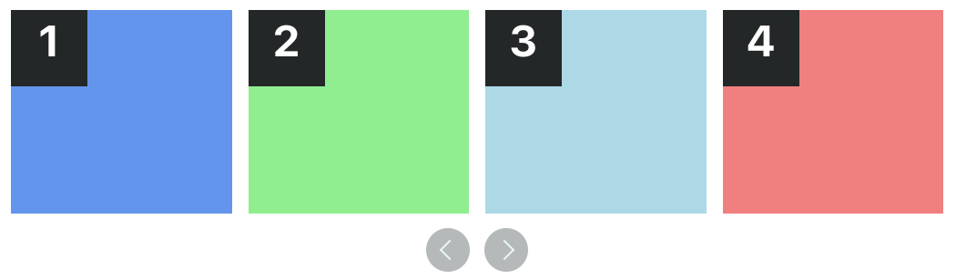
Basic Slider with scroll-margin (mobile)
This is a slideshow with a margin added to the scrollable area, optimized for mobile devices.
Classes:
sc-lt-slider sc-tp-100 sc-op-sm
Custom tag:
<inner-section
  type="slider"
  template="100"
  options="scroll-margin"
></inner-section>
Key for theme.json:
"slider_sm";

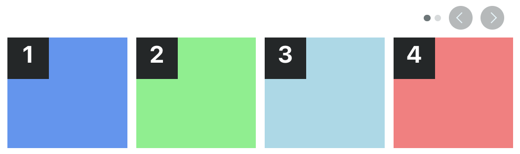
Two Column Carousel
This is a carousel where content is organized in two columns and can be navigated using touch gestures, keyboard arrows or scrollbar.
Classes:
sc-lt-slider sc-tp-50-50
Custom tag:
<inner-section
  type="slider"
  template="50:50"
></inner-section>
Key for theme.json:
"slider_2col";

Three Column Carousel
This is a carousel where content is organized in three columns and can be navigated using touch gestures, keyboard arrows or scrollbar.
Classes:
sc-lt-slider sc-tp-33-33-33
Custom tag:
<inner-section
  type="slider"
  template="33:33:33"
></inner-section>
Key for theme.json:
"slider_3col";

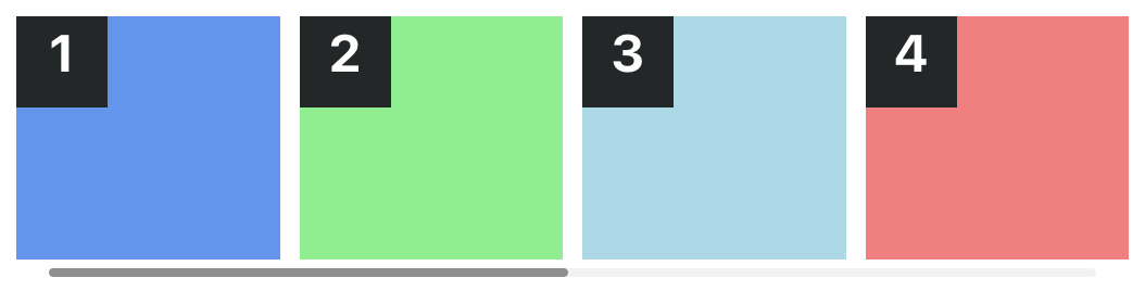
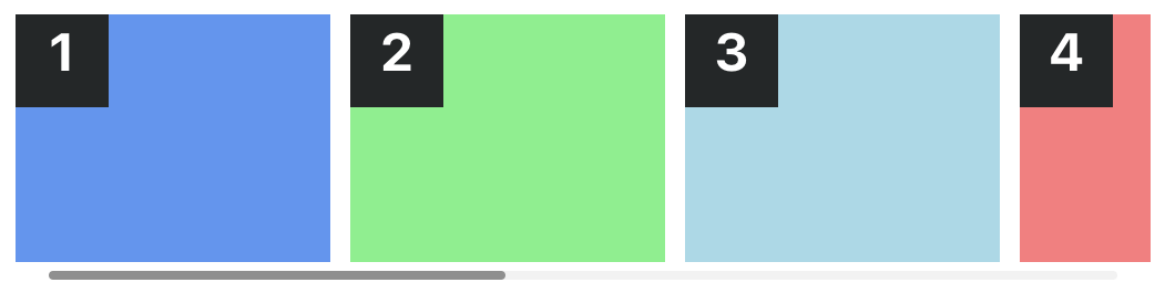
Four Column Carousel
This is a carousel where content is organized in four columns and can be navigated using touch gestures, keyboard arrows or scrollbar.
Classes:
sc-lt-slider sc-tp-25-25-25-25
Custom tag:
<inner-section
  type="slider"
  template="25:25:25:25"
></inner-section>
Key for theme.json:
"slider_4col";
Basic Slider with scroll-hint
This is a slideshow with a hint added to indicate the user that they can swipe to navigate.
Classes:
sc-lt-slider sc-tp-100 sc-op-next
Custom tag:
<inner-section
  type="slider"
  template="100"
  options="scroll-hint-next"
></inner-section>
Key for theme.json:
"slider_next";

Two Column Carousel with scroll-hint
This is a carousel with a hint added to indicate the user that they can swipe to navigate, organized in two columns.
Classes:
sc-lt-slider sc-tp-50-50 sc-op-next
Custom tag:
<inner-section
  type="slider"
  template="50:50"
  options="scroll-hint-next"
></inner-section>
Key for theme.json:
"slider_2col_next";

Three Column Carousel with scroll-hint
This is a carousel with a hint added to indicate the user that they can swipe to navigate, organized in three columns.
Classes:
sc-lt-slider sc-tp-33-33-33 sc-op-next
Custom tag:
<inner-section
  type="slider"
  template="33:33:33"
  options="scroll-hint-next"
></inner-section>
Key for theme.json:
"slider_3col_next";
Four Column Carousel with scroll-hint
This is a carousel with a hint added to indicate the user that they can swipe to navigate, organized in four columns.
Classes:
sc-lt-slider sc-tp-25-25-25-25 sc-op-next
Custom tag:
<inner-section
  type="slider"
  template="25:25:25:25"
  options="scroll-hint-next"
></inner-section>
Key for theme.json:
"slider_4col_next";
Basic Slider with Dual scroll-hint
This is a slideshow with a hint added to both sides to indicate the user that they can swipe to navigate.
Classes:
sc-lt-slider sc-tp-100 sc-op-next sc-op-prev
Custom tag:
<inner-section
  type="slider"
  template="100"
  options="scroll-hint-next scroll-hint-prev"
></inner-section>
Key for theme.json:
"slider_prev_next";

Two Column Carousel with Dual scroll-hint
This is a carousel with a hint added to both sides to indicate the user that they can swipe to navigate, organized in two columns.
Classes:
sc-lt-slider sc-tp-50-50 sc-op-next sc-op-prev
Custom tag:
<inner-section
  type="slider"
  template="50:50"
  options="scroll-hint-next scroll-hint-prev"
></inner-section>
Key for theme.json:
"slider_2col_prev_next";

Three Column Carousel with Dual scroll-hint
This is a carousel with a hint added to both sides to indicate the user that they can swipe to navigate, organized in three columns.
Classes:
sc-lt-slider sc-tp-33-33-33 sc-op-next sc-op-prev
Custom tag:
<inner-section
  type="slider"
  template="33:33:33"
  options="scroll-hint-next scroll-hint-prev"
></inner-section>
Key for theme.json:
"slider_3col_prev_next";
Four Column Carousel with Dual scroll-hint
This is a carousel with a hint added to both sides to indicate the user that they can swipe to navigate, organized in four columns.
Classes:
sc-lt-slider sc-tp-25-25-25-25 sc-op-next sc-op-prev
Custom tag:
<inner-section
  type="slider"
  template="25:25:25:25"
  options="scroll-hint-next scroll-hint-prev"
></inner-section>
Key for theme.json:
"slider_4col_prev_next";
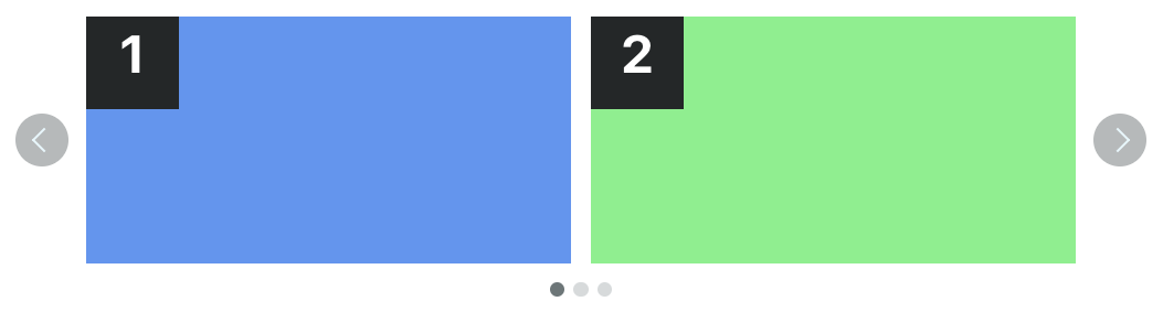
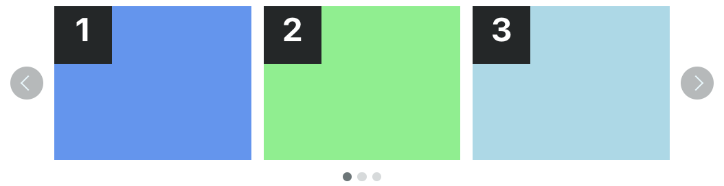
Slider with Outside Navigation
This is a slideshow where content is displayed one at a time, with arrows and dots outside the content area.
Classes:
sc-lt-slider sc-tp-100 sc-nav-outside
Custom tag:
<inner-section
  type="slider"
  template="100"
  options="nav-outside"
></inner-section>
Key for theme.json:
"slider_navout";

Two Column Carousel with Outside Navigation
This is a carousel where content is organized in two columns, with arrows and dots outside the content area.
Classes:
sc-lt-slider sc-tp-50-50 sc-nav-outside
Custom tag:
<inner-section
  type="slider"
  template="50:50"
  options="nav-outside"
></inner-section>
Key for theme.json:
"slider_2col_navout";
Three Column Carousel with Outside Navigation
This is a carousel where content is organized in three columns, with arrows and dots outside the content area.
Classes:
sc-lt-slider sc-tp-33-33-33 sc-nav-outside
Custom tag:
<inner-section
  type="slider"
  template="33:33:33"
  options="nav-outside"
></inner-section>
Key for theme.json:
"slider_3col_navout";
Four Column Carousel with Outside Navigation
This is a carousel where content is organized in four columns, with arrows and dots outside the content area.
Classes:
sc-lt-slider sc-tp-25-25-25-25 sc-nav-outside
Custom tag:
<inner-section
  type="slider"
  template="25:25:25:25"
  options="nav-outside"
></inner-section>
Key for theme.json:
"slider_4col_navout";
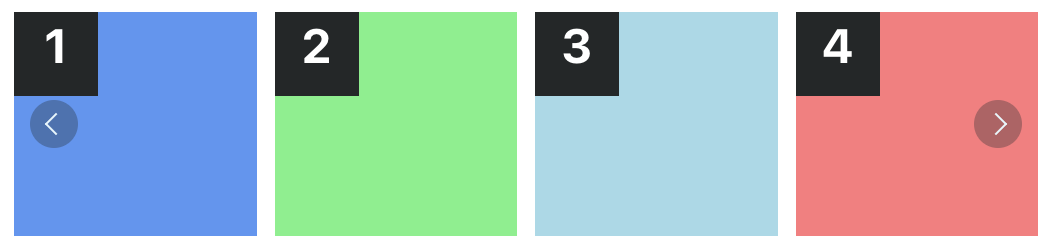
Slider with Inside Navigation
This is a slideshow where content is displayed one at a time, with arrows and dots inside the content area.
Classes:
sc-lt-slider sc-tp-100 sc-nav-inside
Custom tag:
<inner-section
  type="slider"
  template="100"
  options="nav-inside"
></inner-section>
Key for theme.json:
"slider_navin";

Two Column Carousel with Inside Navigation
This is a carousel where content is organized in two columns, with arrows and dots inside the content area.
Classes:
sc-lt-slider sc-tp-50-50 sc-nav-inside
Custom tag:
<inner-section
  type="slider"
  template="50:50"
  options="nav-inside"
></inner-section>
Key for theme.json:
"slider_2col_navin";
Three Column Carousel with Inside Navigation
This is a carousel where content is organized in three columns, with arrows and dots inside the content area.
Classes:
sc-lt-slider sc-tp-33-33-33 sc-nav-inside
Custom tag:
<inner-section
  type="slider"
  template="33:33:33"
  options="nav-inside"
></inner-section>
Key for theme.json:
"slider_3col_navin";

Four Column Carousel with Inside Navigation
This is a carousel where content is organized in four columns, with arrows and dots inside the content area.
Classes:
sc-lt-slider sc-tp-25-25-25-25 sc-nav-inside
Custom tag:
<inner-section
  type="slider"
  template="25:25:25:25"
  options="nav-inside"
></inner-section>
Key for theme.json:
"slider_4col_navin";
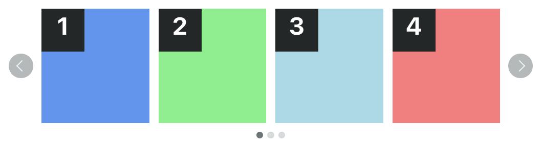
Slider with Bottom Navigation
This is a slideshow where content is displayed one at a time, with arrows at the bottom of the content area.
Classes:
sc-lt-slider sc-tp-100 sc-nav-bottom
Custom tag:
<inner-section
  type="slider"
  template="100"
  options="nav-bottom"
></inner-section>
Key for theme.json:
"slider_navbelow";

Two Column Carousel with Bottom Navigation
This is a carousel where content is organized in two columns, with arrows at the bottom of the content area.
Classes:
sc-lt-slider sc-tp-50-50 sc-nav-bottom
Custom tag:
<inner-section
  type="slider"
  template="50:50"
  options="nav-bottom"
></inner-section>
Key for theme.json:
"slider_2col_navbelow";

Three Column Carousel with Bottom Navigation
This is a carousel where content is organized in three columns, with arrows at the bottom of the content area.
Classes:
sc-lt-slider sc-tp-33-33-33 sc-nav-bottom
Custom tag:
<inner-section
  type="slider"
  template="33:33:33"
  options="nav-bottom"
></inner-section>
Key for theme.json:
"slider_3col_navbelow";

Four Column Carousel with Bottom Navigation
This is a carousel where content is organized in four columns, with arrows at the bottom of the content area.
Classes:
sc-lt-slider sc-tp-25-25-25-25 sc-nav-bottom
Custom tag:
<inner-section
  type="slider"
  template="25:25:25:25"
  options="nav-bottom"
></inner-section>
Key for theme.json:
"slider_4col_navbelow";
Slider with Navigation Above
This is a slideshow where content is displayed one at a time, with arrows and dots above the content area.
Classes:
sc-lt-slider sc-tp-100 sc-nav-top
Custom tag:
<inner-section
  type="slider"
  template="100"
  options="nav-top"
></inner-section>
Key for theme.json:
"slider_navabove";

Two Column Carousel with Navigation Above
This is a carousel where content is organized in two columns, with arrows and dots above the content area.
Classes:
sc-lt-slider sc-tp-50-50 sc-nav-top
Custom tag:
<inner-section
  type="slider"
  template="50:50"
  options="nav-top"
></inner-section>
Key for theme.json:
"slider_2col_navabove";
Three Column Carousel with Navigation Above
This is a carousel where content is organized in three columns, with arrows and dots above the content area.
Classes:
sc-lt-slider sc-tp-33-33-33 sc-nav-top
Custom tag:
<inner-section
  type="slider"
  template="33:33:33"
  options="nav-top"
></inner-section>
Key for theme.json:
"slider_3col_navabove";

Four Column Carousel with Navigation Above
This is a carousel where content is organized in four columns, with arrows and dots above the content area.
Classes:
sc-lt-slider sc-tp-25-25-25-25 sc-nav-top
Custom tag:
<inner-section
  type="slider"
  template="25:25:25:25"
  options="nav-top"
></inner-section>
Key for theme.json:
"slider_4col_navabove";
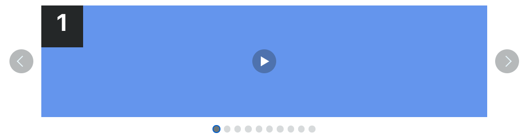
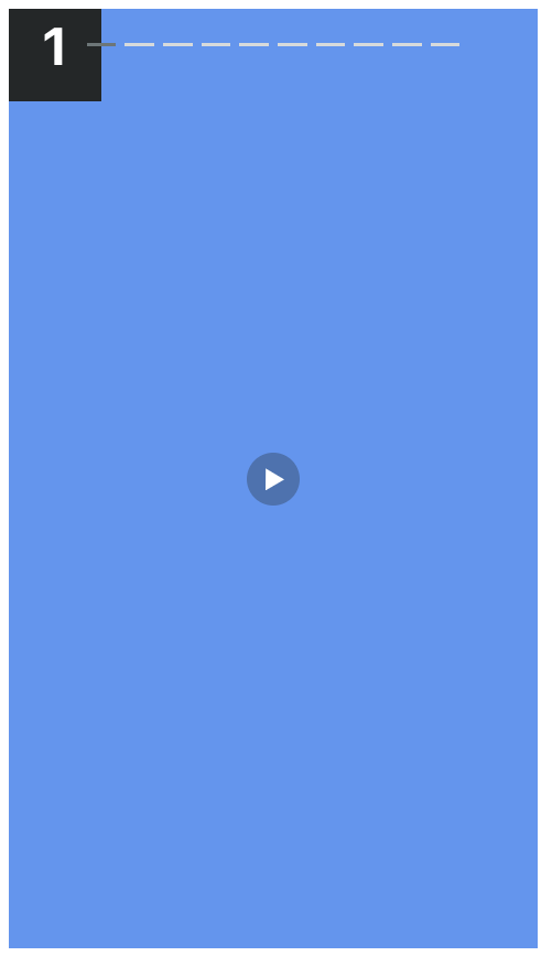
Storytelling, with AutoPlay
This is a slideshow where content is displayed one at a time, with arrows, dots and play-button inside the content area. Requires sc-nav-autoplay for autoplaying to work.
Classes:
sc-lt-slider sc-tp-100 sc-nav-story sc-nav-autoplay
Custom tag:
<inner-section
  type="slider"
  template="100"
  options="nav-story"
></inner-section>
Key for theme.json:
"story_autoplay";
Slider with Autoplay
This is a slideshow where content is displayed one at a time, with arrows and dots outside the content area. Add sc-nav-autoplay for autoplaying to work.
Classes:
sc-lt-slider sc-tp-100 sc-nav-outside sc-nav-autoplay
Custom tag:
<inner-section
  type="slider"
  template="100"
  options="nav-outside autoplay"
></inner-section>
Key for theme.json:
"slider_autoplay";