Developers - CLI and Themes- Layout System
Layout System
Introduction
Our CSS Layout Systen is a design system designed to handle layouts on your website.
It handles spacing, grids / layouts, padding and alignment — and allows you to compose a page with a uniform structure. You can use it with our custom tags, or regular classes.
To use it in your project, grab the minified CSS and include it in your bundle, or link to it directly:
- CSS
- Npm
- Yarn
- Pnpm
- Bun
<link href="https://cdn.perfection.dev/layouts/layout.props.css" rel="stylesheet" />
<link href="https://cdn.perfection.dev/layouts/utility.min.css" rel="stylesheet" />
<link href="https://cdn.perfection.dev/layouts/layout.min.css" rel="stylesheet" >
npm install @perfectiondev/layout-helpers
yarn global add @perfectiondev/layout-helpers
pnpm i -g @perfectiondev/layout-helpers
bun add -g @perfectiondev/layout-helpers
HTML Syntax
1. Outer Section
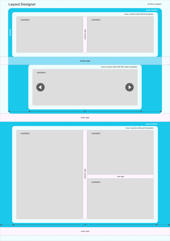
A webpage contains sections. In our system, these are called outer-section’s, and are placed within an optional section-wrapper. This element also controls the global spacing between outer-section’s, called outer-gap.
2. Inner Section
An outer-section wraps inner-section’s. This element also controls the global spacing between inner-section’s, called section-gap.
An inner-section contains content, and is where the layouting takes place. You can swap out a template for a inner-section, to completely re-arrange the content within.

Working with our Perfection Layouts, you can either use our custom tags:
<outer-section>
  <inner-section>
    <!-- your html -->
  </inner-section>
</outer-section>
Or regular classes:
<div class="sc-outer">
  <div class="sc-inner">
    <!-- your html -->
  </div>
</div>
In our Section Designer-tool, you'll be using classes — but you can combine it however you want, when implementing it.
Templates
Collection of 70 Layout Templates
Create your own
It's easy to create your own templates, but you need to know how CSS grid works! First, familiarize yourself with our Internal Properties. Let's look into one of the built-in templates, to see how the CSS is done:
Example 1 (25:75)
25:75 is a two-column layout where the first column occupies 25% of the width and the second column occupies 75%.
The classes are:
sc-lt-grid sc-tp-25-75
This tells us that the type of the layout is CSS grid: sc-lt-grid
The second class is the template, prefixed with sc-tp- (for section template).
We recommend you keep this naming practice.
All classes starting with -sc-tp- will be one column on mobile devices:
@media (max-width: 480px) {
  [template],
  [class*="sc-tp-"] {
    --_c: 1;
  }
}
If you dont't want this, you need to break away from the naming-convention.
For the next breakpoint, we want the layout to break into two equal columns:
@media (min-width: 480px) {
  .sc-tp-25-75 {
    --_c: 2;
  }
}

Now, for the final breakpoint in our example, we want four columns.
@media (min-width: 768px) {
  .sc-tp-25-75 {
    --_c: 4;
  }
}
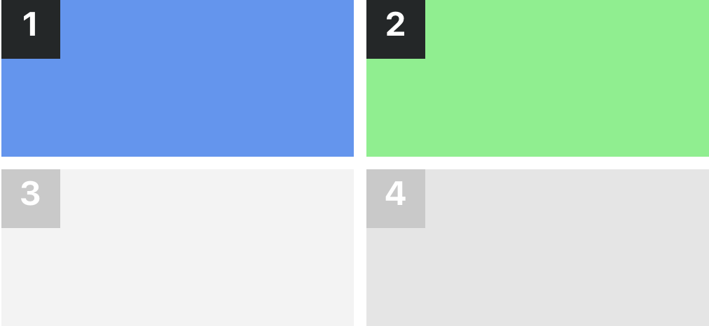
Why? Because we want the columns to be 25% and 75%, so one column will be 1/4 and the other 3/4.
We now need the column-span-variable, --_cs, but only for the 2nd item:
.sc-tp-25-75 > *:nth-child(2n + 0) {
  --_cs: span 3;
}
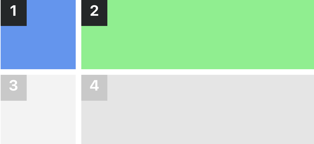
We use 2n+0 so we'll catch repeating elements (if the content-creator adds more items to the layout than just two). This gives us:

If you want to support our custom tag, like this:
<inner-section template="25:75"></inner-section>
You'll need to add an extra selector to the CSS.
Example:
@media (min-width: 768px) {
  [template="25:75"],
  .sc-tp-25-75 {
    --_c: 4;
  }
}
Example 2 (30:70)
30:70 is a two-column layout where the first column occupies 30% of the width and the second column occupies 70%. This layout is not included in our templates, so what do you do?
For the first two breakpoints, it's similar to the example above, but for the final breakpoint, you'll need 10 columns:
@media (min-width: 768px) {
  .sc-tp-30-70 {
    --_c: 10;
  }
  .sc-tp-30-70 > *:nth-child(1n + 0) {
    --_cs: span 3;
  }
  .sc-tp-30-70 > *:nth-child(2n + 0) {
    --_cs: span 7;
  }
}