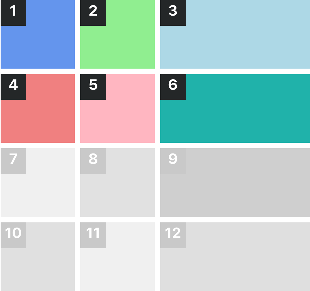
Developers - CSS Layout System
Templates Grid
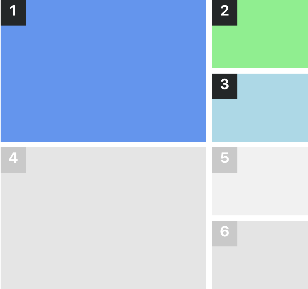
Grid with 1 Large, 2 Small
Grid with 3 items. The first item is 2/3 of the width and the other two items are 1/3 of the width.
Classes:
sc-lt-grid sc-tp-1l_2sq
Custom tag:
<inner-section template="1l_2sq"></inner-section>
Key for theme.json:
"grid_1l_2sq";
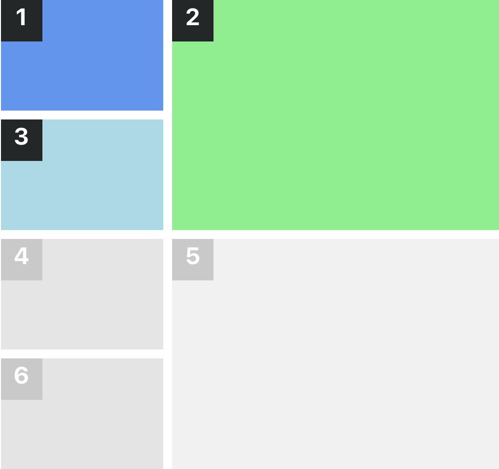
Grid with 2 Small, 1 Large
Grid with 3 items. The first and third items are 1/3 of the width and the second 2/3 of the width.
Classes:
sc-lt-grid sc-tp-2s_1l
Custom tag:
<inner-section template="2s_1l"></inner-section>
Key for theme.json:
"grid_2s_1l";
Grid with 3 Small, 1 Large
Grid with 4 items. The first item is 2/3 of the width and half of the height, the second 1/3 of the width and full height, the last items are 1/3 of the width and half of the height.
Classes:
sc-lt-grid sc-tp-3s_1l
Custom tag:
<inner-section template="3s_1l"></inner-section>
Key for theme.json:
"grid_3s_1l";
Grid with 1 Large, 3 Small
Grid with 4 items. The first item is 1/3 of the width and full height, the second 2/3 of the width and half of the height, the last items are 1/3 of the width and half of the height.
Classes:
sc-lt-grid sc-tp-1l_3sm
Custom tag:
<inner-section template="1l_3sm"></inner-section>
Key for theme.json:
"grid_1l_3sm";

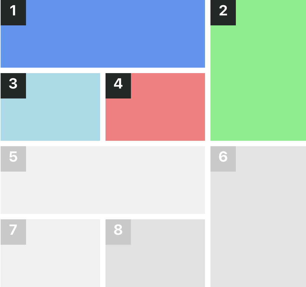
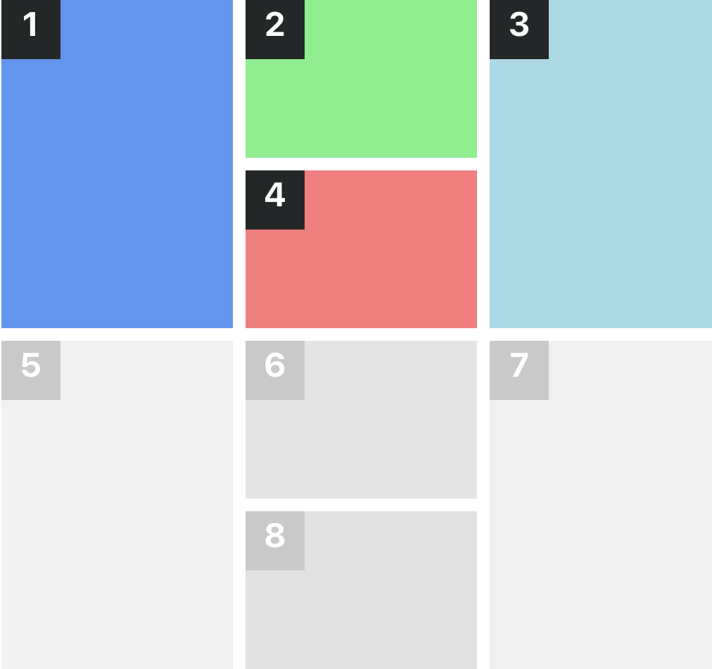
Grid with 1 Large, 2 Small, 1 Large
Grid with 4 items. The first and third items are full height, the second and fourth items are half of the height
Classes:
sc-lt-grid sc-tp-1l_2s_1l
Custom tag:
<inner-section template="1l_2s_1l"></inner-section>
Key for theme.json:
"grid_1l_2s_1l";
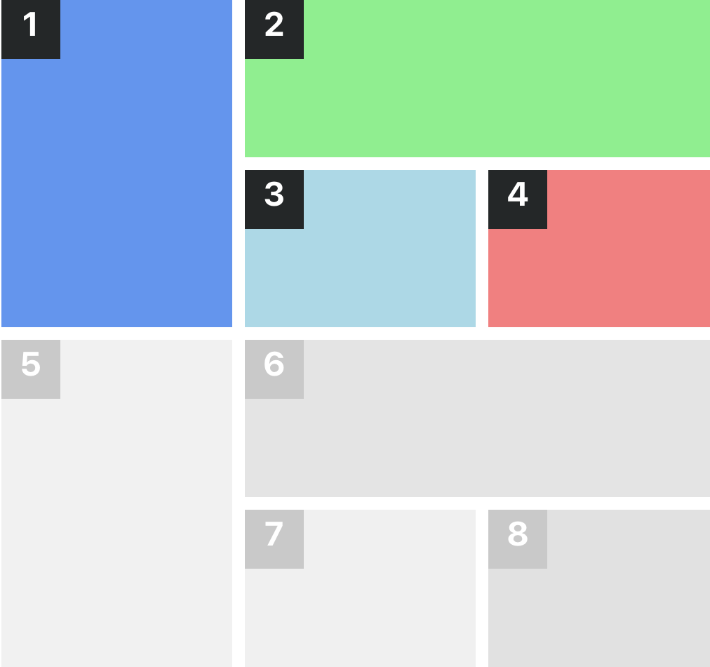
Grid with 1 Large, 3 Small
Grid with 4 items. The first item is 2/3 of the width and full height, the other items are all 1/3 of the width and 1/3 of the height.
Classes:
sc-lt-grid sc-tp-1l_3s
Custom tag:
<inner-section template="1l_3s"></inner-section>
Key for theme.json:
"grid_1l_3s";
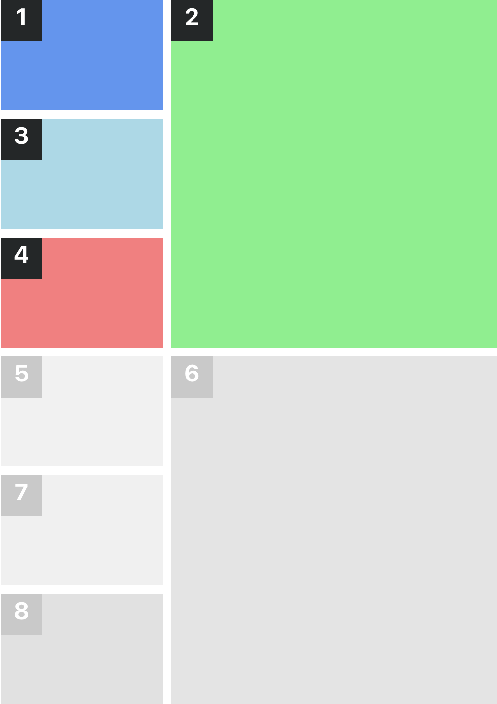
Grid with 3 Small, 1 Large
Grid with 4 items. The first, third and fourth items are 1/3 of the width and 1/3 of the height, the second item is 2/3 of the width and full height.
Classes:
sc-lt-grid sc-tp-3sq_1l
Custom tag:
<inner-section template="3sq_1l"></inner-section>
Key for theme.json:
"grid_3sq_1l";
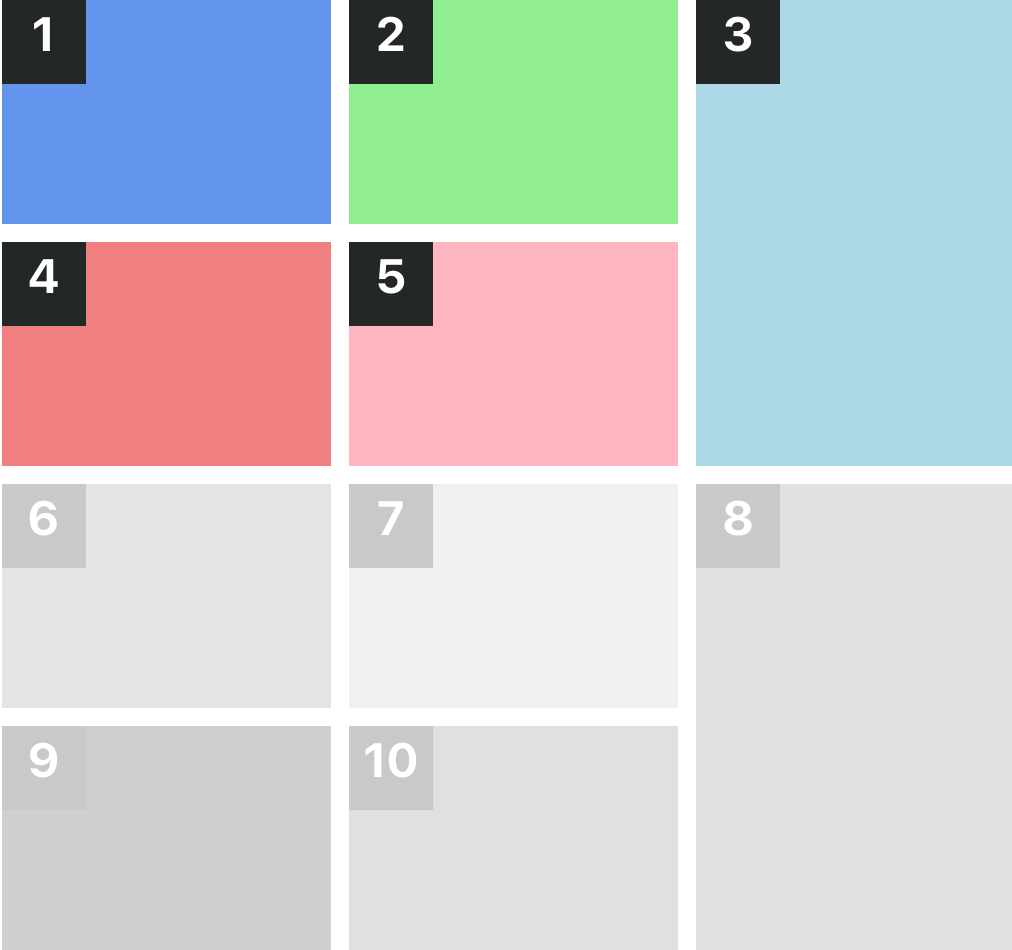
Grid with 4 Small, 1 Large
This is a five-column layout where the first item is 1/3 of the width and full height, the other items are 1/3 of the width and half of the height.
Classes:
sc-lt-grid sc-tp-4s_1l
Custom tag:
<inner-section template="4s_1l"></inner-section>
Key for theme.json:
"grid_4s_1l";
Grid with 1 Large, 4 Small
This is a five-column layout where the first item is 1/3 of the width and full height, the other items are 1/3 of the width and half of the height.
Classes:
sc-lt-grid sc-tp-1l_4s
Custom tag:
<inner-section template="1l_4s"></inner-section>
Key for theme.json:
"grid_1l_4s";
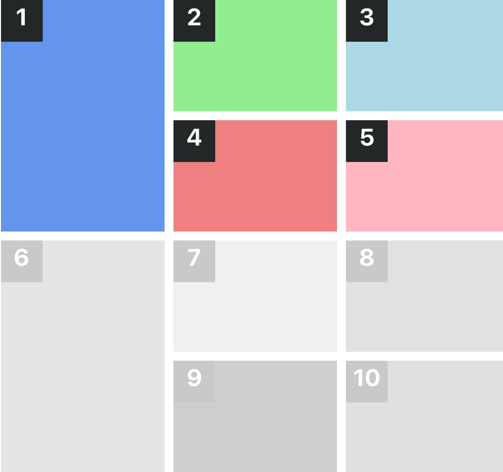
Grid with 3 Small, 2 Large
This is a five-column layout where the first item is 1/3 of the width and full height, the other items are 1/3 of the width and half of the height.
Classes:
sc-lt-grid sc-tp-3s_2l
Custom tag:
<inner-section template="3s_2l"></inner-section>
Key for theme.json:
"grid_3s_2l";
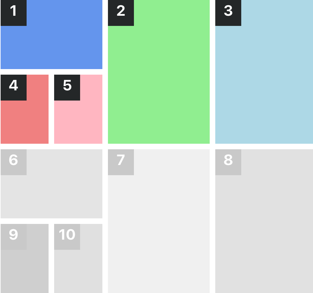
Grid with 4 Small, 1 Large
This is a five-column layout where the first item is 1/3 of the width and full height, the other items are 1/3 of the width and half of the height.
Classes:
sc-lt-grid sc-tp-h4s_4l
Custom tag:
<inner-section template="h4s_4l"></inner-section>
Key for theme.json:
"grid_4s_1l";
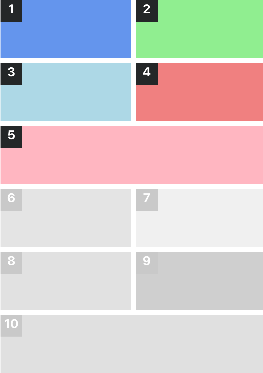
Grid with 4 Small, 2 Large
This is a six-column layout where the first item is 1/3 of the width and full height, the other items are 1/3 of the width and half of the height.
Classes:
sc-lt-grid sc-tp-4s_2l
Custom tag:
<inner-section template="4s_2l"></inner-section>
Key for theme.json:
"vgrid_4s_2l";
